3. Layout
Overview
Since DomKit "widgets" are simply HTML + CSS, they can be placed most anywhere in the DOM tree. However, since DomKit is specifically targeted at building rich user interfaces, it includes some standard layout containers to simplify constructing common UI designs:
Box
Box is the base class for Elems who are intended to layout out their children in a specific way. Box defaults several CSS properties to simplify composition:
display: block;
box-sizing: border-box;
width: 100%;
height: 100%;
position: relative;
GridBox
GridBox lays out children in a table format with a fixed number of columns and rows.
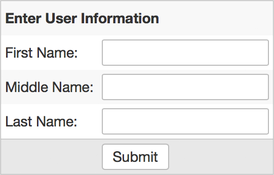
Example
GridBox
{
  it.cellStyle("*",    "*", "padding: 4px")
  it.cellStyle("*", "even", "background: #f8f8f8")
  it.cellStyle("*",     4,  "background: #e8e8e8; border-top: 1px solid #ccc")

  it.addRow([Label {
    it.text = "Enter User Information"
    it.style->fontWeight = "bold"
  }], [2])
  it.addRow([Label { it.text="First Name:"  }, TextField {}])
  it.addRow([Label { it.text="Middle Name:" }, TextField {}])
  it.addRow([Label { it.text="Last Name:"   }, TextField {}])
  it.addRow([null, Button { it.text="Submit" }])
}
cellStyle
The cellStyle command may be used to stylize groups of cells. Valid values for col and row:
- Specific index (0, 1, 2, etc)
- Range of indexes (0..4, 7..<8, etc)
- "*": apply to all row or columns
- "even": apply only to even row or columns indexes
- "odd": apply only to odd row or column indexes
cellStyle("*",   "*", "padding: 4px")
cellStyle("*", "odd", "padding: 4px")
cellStyle(  0,     1, "padding: 4px")
cellStyle(  3,  2..5, "padding: 4px")
addRow
Children are added to a GridBox a row at a time using addRow. If null is passed for any position on the row, that cell will be left empty:
// leave first cell empty
it.addRow([null, Button { it.text="Submit" }])
Optionally, addRow takes an argument that can specify that child cells should span multiple columns:
// pass a single child, but specify it should span 2 columns
it.addRow([Label {
  it.text = "Enter User Information"
  it.style->fontWeight = "bold"
}], [2])
The colspan argument may be applied to multiple children, and the list values correspond to the child list position:
// Add two children, where child1 spans 2 columns, and child2 3 columns
grid.addRow([child1, child2], [2,3])
removeRow
Rows in a GridBox can be removed by index using removeRow:
grid.removeRow(2)
If the a row does not exist at the given index, this method does nothing.
halign
By default GridBox will use preferred sizes for all child cells. This will often times leave free space around the GridBox. To adjust how the GridBox is positioned in this space use GridBox.halign:
GridBox { it.halign = Align.center }
FlowBox
FlowBox lays out child nodes side-by-side horizontally.
FlowBox
{
  Button { it.text="Alpha" },
  Button { it.text="Beta"  },
  Button { it.text="Gamma" },
}
The alignment of children inside a FlowBox can be adjusted using halign:
FlowBox
{
  it.halign = Align.center
  Button { it.text="Alpha" },
  Button { it.text="Beta"  },
  Button { it.text="Gamma" },
}
The spacing between each child can be configured use gaps, where each gap is the space between index and index+1 children:
FlowBox
{
  it.gaps = ["4px", "16px"]
  Button { it.text="Alpha" },  // 4px gap after Alpha
  Button { it.text="Beta"  },  // 16px gap after Beta
  Button { it.text="Gamma" },
}
If a FlowBox contains more children than gaps, the gaps list will be cycled over the child list:
FlowBox
{
  it.gaps = ["4px", "1px"]
  Button { ... },   // 4px gap after
  Button { ... },   // 1px gap after
  Button { ... },   // 4px gap after
  Button { ... },
}

FlowBox
{
  it.gaps = ["4px"]
  ...  // 4px gap between all children
}
SashBox
SashBox divides a container size in one direction with flexible child sizes:
SashBox
{
  it.sizes = ["25px, "100%", "50px"]
  Box { it.text="Child 1" },
  Box { it.text="Child 2" },
  Box { it.text="Child 3" },
}

+----------+----------------------------------+--------------------+
|          |                                  |                    |
|  Child 1 |            Child 2               |      Child 3       |
|          |                                  |                    |
+----------+----------------------------------+--------------------+
Fixed px sizes can be mixed with % sizes to divide space. When mixing px and %, the pixel sizes are computed first, and the remaining space is divided up per percentage. Sizes are applied using the CSS calc() function.
By default children are laid out left to right. To layout top to bottom, configure the dir field:
SashBox
{
  it.dir = Dir.down
  it.sizes = ["100px", "100%"]
  Box { it.text="Child 1" },
  Box { it.text="Child 2" },
}
By default, sashes are fixed, but you can enable resizing by setting the resizable field and adding dividers field:
SashBox
{
  it.resizable = true
  it.sizes = ["40%", "5px", "60%"]
  Box { it.text="Child 1" },
  SashBox.div,
  Box { it.text="Child 2" },
}
When resizable is true, the minSize field may be used to limit the minimum size a sash is resized to.
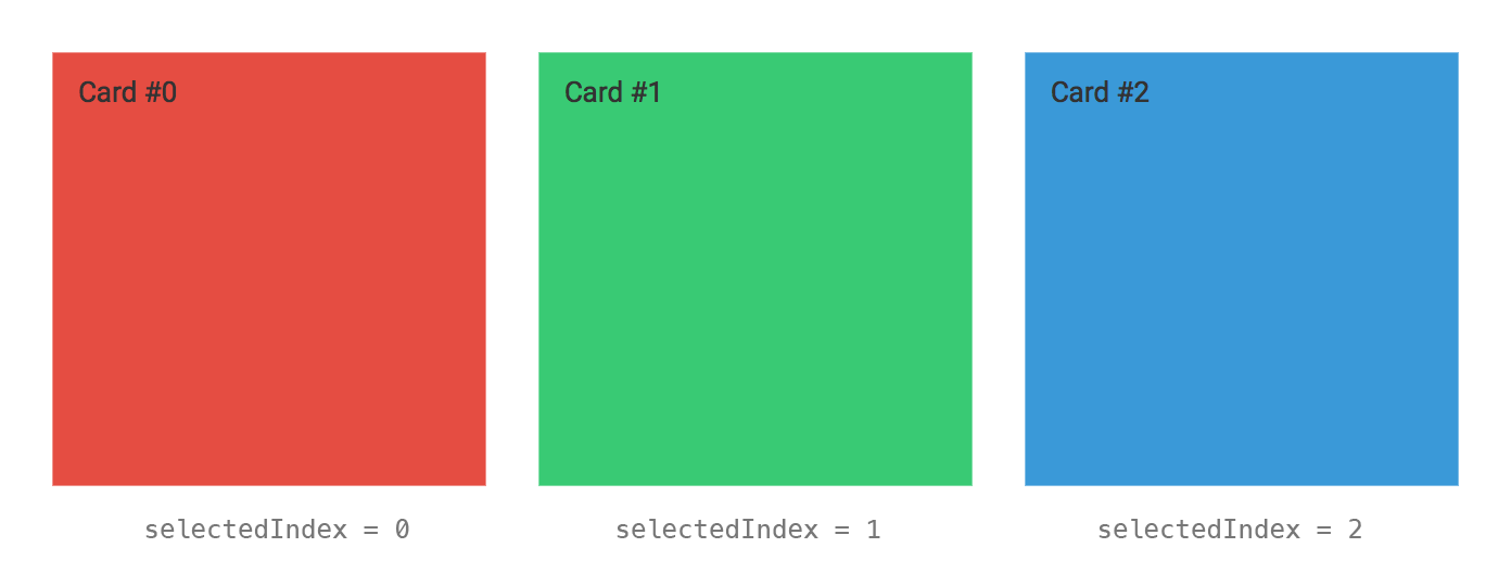
CardBox
CardBox lays out child elements as a stack of cards, where only one card may be visible at a time:
CardBox
{
  Box { it.style->background="#e74c3c"; it.text="Card #0" },
  Box { it.style->background="#2ecc71"; it.text="Card #1" },
  Box { it.style->background="#3498db"; it.text="Card #2" },
}
The visible card is changed using selIndex:
cardBox.selIndex = 2
WellBox
WellBox displays content in recessed well:
WellBox { content, }

FlexBox
FlexBox lays out children based on the CSS Flexbox layout model. Flexbox can be a little overwhelming to wrap your head around. A great tutorial that manages to explain it can be found here:
https://css-tricks.com/snippets/css/a-guide-to-flexbox/
In practice, only a subset of the flex model is used in domkit, and should be contained to "micro-layouts" for best results. The most common use case is to layout toolbars, such that items are centered vertically and to left/center/right align items.
This example creates a toolbar with several buttons left-aligned:
FlexBox
{
  it.flex = ["1 1 auto"]
  FlowBox {
    it.gaps = ["4px"]
    Button { ... },
    Button { ... },
    Button { ... },
  },
}
To add another button that is right-aligned to the toolbar:
FlexBox
{
  it.flex = ["1 1 auto", "0 0 auto"]
  FlowBox { ... },
  Button { ... },
}
The flex argument specifies how the parents size should be distributed to its children. There should be a flex entry for each child. The "0 0 auto" entry indicates this child should be given its preferred width, and should not grow or shrink as the parent size changes. The "1 1 auto" argument indicates that first our child should be laid out with its preferred size, and then any left over space should be allocated as well. This in effect pushes the second child to be right aligned in the container.